Web Design
Research-led interfaces where every section earns its scroll. Wireframe to polish, tested against real users.
Web design is the part of the project that decides whether a visitor understands you in the first five seconds — and whether they do anything about it. We design sites that are built to be used: a clear path from the headline to the enquiry, sections that each carry their own weight, and an interface that still makes sense on a five-year-old Android on a bad connection.
This is design work, not decoration. Before anything is drawn we want to know who is arriving, what they are trying to find out, and what the single most valuable action on the page is. Everything after that is in service of getting more people to that action without making the site feel like a funnel.
What web design covers here
A WeDominators design engagement produces the things a developer can actually build from, and the things you can keep using after launch:
- Research and page strategy — who the page is for, what they already believe, what objections have to be answered before they will act, and the order those things need to appear in.
- Information architecture — the sitemap, the navigation, and the URL structure. Getting this wrong is expensive later, because it is what your SEO and your ad landing pages both hang off.
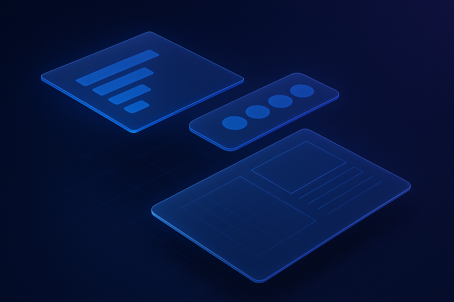
- Wireframes — the layout and hierarchy of every unique template, agreed before a single color is chosen. Cheap to change at this stage, costly to change after.
- Visual design — type scale, color, spacing, imagery, motion. Applied as a system rather than page by page, so the twentieth page still looks like the first.
- A design system — documented components, states and tokens, handed over so your team can add pages later without the site drifting.
- Responsive and accessible behavior — how each component reflows, what it looks like on a phone, how it behaves for keyboard and screen-reader users.
- Developer handover — annotated files, exported assets and the notes that stop a build becoming a guessing game.
How the process runs
- Discovery. We go through your analytics, your search data, your sales objections and your competitors. If you have a current site, we look at where people are actually leaving.
- Structure. Sitemap and wireframes for every unique template. You review layout and message before any visual design happens, which is the cheapest possible point to disagree.
- Design. Key templates first — usually home, a service page and a conversion page — then the rest of the system once the direction is signed off.
- Review. Structured rounds with named feedback, not an open-ended comment thread. Every change is logged so nothing gets lost between rounds.
- Handover. Files, components, assets and documentation go to whoever is building it — our team or yours.
Typical time to a first concept is around two weeks. A full multi-template design system takes longer, and we will tell you which one your project actually needs rather than defaulting to the larger number.
Designing for conversion, not for awards
A site can be beautiful and still fail commercially. The things that move the numbers are rarely the things that win design awards:
- One obvious next step per screen. Competing calls to action split attention and reduce the odds of any of them being taken.
- Proof close to the ask. Testimonials, results and credentials belong next to the button, not on a separate page nobody visits.
- Objection handling in the layout. Price, timescale, lock-in, “will this work for my industry” — if the page does not answer these, the form will not either.
- Forms that ask for as little as possible. Every additional field costs completions. Ask for what you need to have the first conversation, and nothing else.
- Readable typography. Line length, contrast and size do more for engagement than most visual flourishes.
Design that survives contact with a CMS
Most design work falls apart the first time a non-designer adds a page. We design for the editor as well as the visitor: components that hold up with more text than the mockup had, empty states that do not break the grid, and image ratios that are enforced rather than hoped for.
Because most of what we design is built in WordPress, we design against what the editor can actually do. That means the layouts you sign off are the layouts you can maintain — not an approximation a developer had to compromise into place.
Performance and accessibility are design decisions
Whether a site is fast is largely decided in design, not in development. Hero videos, oversized imagery, a dozen font weights and heavy animation are design choices with a measurable cost on a mobile connection. We make those trade-offs deliberately and tell you what each one costs.
The same applies to accessibility. Color contrast, focus states, target sizes, heading order and sensible alt text are all decided at design time. Building them in at the start costs nothing; retrofitting them after launch is a project of its own.
Who this is for
Web design is the right starting point if your site looks dated against the people you compete with, if traffic arrives but does not convert, if the current site is impossible to update without help, or if you are launching something new and want the structure right the first time.
If your problem is that the site is slow, buggy or awkward to run rather than how it looks, web development is probably the better place to start. If you are selling products rather than services, ecommerce web design covers the extra ground that catalogs, checkouts and product pages need.
What you get at the end
A design system rather than a folder of images: documented components, agreed states, exported assets, and templates that your team can extend without a designer in the room. Plus the reasoning — why the page is ordered the way it is, so that when you want to change something later you are not guessing at the original intent.


Other services
Next step
Let's talk about Web Design.
Pick the audit you need. Within 48 hours you'll get a written teardown: free and specific.