Why Shoppers Abandon Your Checkout — And How to Fix It
Somebody found your store, browsed your catalog, chose a product, added it to their basket — and then left. They did the hard part. They wanted the thing. And somewhere between the basket and the payment confirmation, they changed their mind or simply gave up.
Across ecommerce generally, most baskets are abandoned. That figure is quoted so often it has stopped meaning anything, and it encourages a fatalistic attitude: abandonment is just how the internet works, nothing to be done. That is wrong. A meaningful share of those people were entirely willing to buy and were stopped by something specific, fixable, and usually boring.
This article goes through the reasons people abandon, roughly in order of how much money they cost, and what to do about each.
Separate the two kinds of abandonment
Before fixing anything, split the problem in two, because they have completely different causes.
- Basket abandonment — they added something and never started checkout. Often this is not a problem at all. Using the basket as a wishlist, comparing options, or saving something for payday are all normal behaviour.
- Checkout abandonment — they started checkout and did not finish. This is where the real damage is. Someone who began entering an address had decided to buy, and something stopped them.
If your analytics does not distinguish these, that is the first fix. Chasing a scary basket-abandonment number when the checkout is the leaking step wastes months.
Unexpected costs at the end
This is consistently the largest single cause, and it is entirely self-inflicted. Someone has mentally committed to a price. They reach the final step and the total is higher — delivery, a handling fee, tax that was not displayed, a surcharge for their payment method. The feeling is not “this is too expensive”, it is “I have been misled”, and that reaction is much harder to recover from.
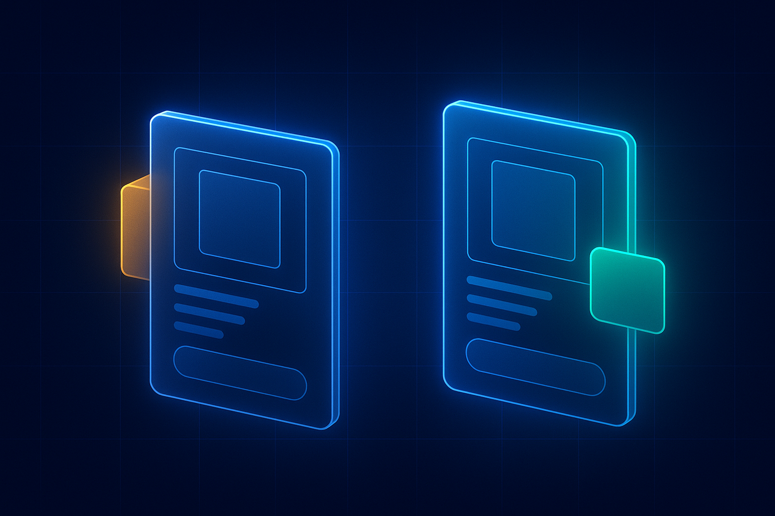
The fix is not necessarily cheaper delivery. It is earlier delivery information:
- State delivery cost on the product page, not only in the basket. Even a range is better than silence.
- Show the threshold for free delivery and how far away they are from it. This routinely increases order value as well as completion.
- Display taxes according to what your customers expect for the market you sell into, consistently across the whole journey.
- Never add a surprise fee at the final step. If a payment surcharge is unavoidable, say so at the point the method is chosen.
A useful exercise: buy your own product, on a phone, and note the exact moment you learn the true total. If that moment is on the last screen, you have found your biggest leak.
Forced account creation
The second-largest cause, and the easiest to fix. A customer wants one product. You ask them to create an account, choose a password, and possibly confirm an email address before they can pay. For a first-time buyer with no loyalty to you, that is a lot of commitment in exchange for nothing.
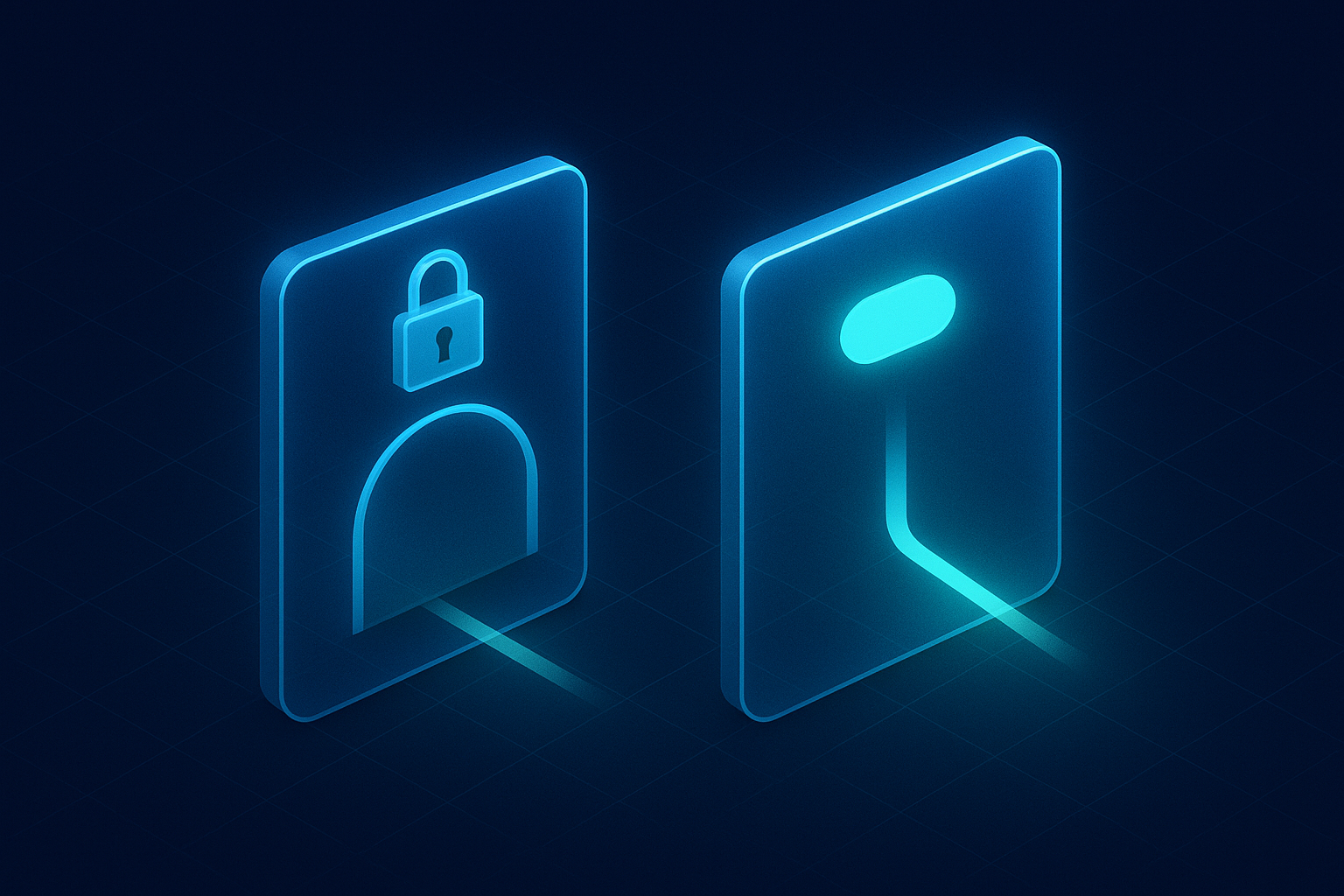
Offer guest checkout, prominently, and do not make it the visually smaller option. You still capture the email address, because you need it for the receipt — so you lose nothing by not demanding a password. Offer account creation on the confirmation page instead, with the order already attached. Far more people accept at that point, because by then you have delivered something.
The checkout is too long or too confusing
Every field, step and decision is an opportunity to stop. Common excesses:
- Asking for a company name, a second address line and a title from everyone, when most of it is optional.
- Separate billing and delivery addresses shown by default, rather than one address with a “different billing address” option.
- A phone number demanded without explanation. If the courier needs it, say that.
- No progress indication in a multi-step checkout, so nobody knows whether there are two steps left or six.
- Losing entered data on an error, which is the fastest way to lose a sale after someone has already invested effort.
- No address lookup. Typing a full address on a phone is tedious and error-prone; a postcode lookup removes most of that.
Go through your own checkout and justify each field out loud. Anything you cannot justify, remove or make optional.
Payment methods they do not have
If someone’s preferred payment method is missing, a proportion will simply leave — particularly on mobile, where wallet payments turn a two-minute form into a thumbprint.
Offer the major cards, the wallets that suit your customers’ devices, and whatever regional methods matter for the markets you sell into. If your basket values are high, buy-now-pay-later options change the decision for a meaningful group of customers. This is not about offering everything; it is about not missing the one your particular audience expects.
Trust breaks at the last moment
The payment page is where doubt peaks. The visitor is about to hand card details to a company they may have met ten minutes ago.
Reassurance belongs precisely here: a visible returns policy in plain words, a delivery estimate stated as a date rather than “3-5 working days”, contact details that suggest a real company, recognisable payment logos, and the security indicators people look for. Conversely, anything that undermines trust at this point — a broken layout, a third-party page that looks nothing like your store, a certificate warning — is disproportionately expensive.
Redirecting to an unbranded payment page is one of the more common trust breaks, and it is usually avoidable now that most providers support an embedded, styled checkout.
It is slow, or it is broken on a phone
Most ecommerce traffic is mobile, and checkout is the most technically demanding part of the journey. Problems that would be a minor irritation elsewhere become abandonment here.
Look for: a slow basket page, form fields that trigger the wrong keyboard, a layout that shifts as things load and causes mis-taps, buttons hidden behind a sticky banner, and the cookie or newsletter pop-up that appears over the payment form. Test the entire flow on a real mid-range phone on mobile data, not on a desktop with a cached page.
It is also worth testing on the second-most-common browser your analytics reports, not just the first. Checkout bugs are frequently browser-specific and can run for months unnoticed because nobody internally uses that browser.
The basket page itself is doing damage
The basket is treated as a waiting room, which is why it is so often neglected. In practice it is a decision point, and several common patterns push people away from it.
- No product images. A list of names and prices makes it harder to feel good about the purchase. Show what they chose.
- No way to change quantity or remove an item easily. If adjusting the basket is awkward, some people start again elsewhere.
- A coupon field in the middle of everything. An empty discount box is an instruction to go and look for a discount code. A meaningful number of people leave to search, find a third-party site, and either return with an expired code or do not return at all. Make it a small link rather than an open field.
- Cross-sells that distract. Suggesting a related item is fine; a full recommendation carousel at the moment of decision competes with the checkout button.
- No stock reassurance. If an item is low in stock, say so plainly. If it is in stock, say that too.
- A “continue shopping” button more prominent than “checkout”. Surprisingly common, and it is an invitation to postpone.
Delivery choice is part of the product
For a large share of shoppers, the delivery options are as much a part of the buying decision as the item. Getting this right closes sales that the product page alone would not.
Give a real date rather than a duration — “arrives Thursday 2 October” is concrete in a way “3-5 working days” is not. Offer a choice where you can: a cheaper slow option and a faster paid one lets people self-select rather than deciding you are too expensive. Be explicit about cut-off times, because “order within four hours for tomorrow” converts. And if you cannot deliver to somewhere, say so before they have filled in an address.
Returns belong in the same category. A clear, generous, plainly-worded returns policy shown at the point of payment removes the last significant objection for anything people might need to try. Burying it in a footer link labelled “terms” wastes the goodwill it should buy you.
What about discount codes and urgency?
Two tactics come up in every conversation about abandonment, and both are more double-edged than they look.
Discounting to rescue a basket works in the short term and trains behaviour in the long term. If a discount reliably arrives an hour after abandoning, your most engaged customers will learn to abandon deliberately, and you will have converted full-price sales into discounted ones. If you use discounts in recovery, vary them, cap them, and avoid applying them to repeat customers who were going to buy anyway.
Urgency and scarcity are effective when true and corrosive when not. Real low stock, a genuine deadline, and an honest delivery cut-off all help someone decide. A countdown that resets on refresh, or “seven people are viewing this” generated at random, will be spotted by some proportion of visitors — and once one claim is disbelieved, the delivery promise and the returns policy are disbelieved too. The cost is invisible in the short term and real in the long one.
Recovering the ones you still lose
Some abandonment is unavoidable, and a proportion of it is recoverable if you have permission to make contact.
- Abandoned basket emails remain one of the highest-returning automations in ecommerce. A short sequence — a reminder within a few hours, a follow-up a day later — does most of the work.
- Lead with the product, not the discount. If every abandonment produces a discount code, you teach regular customers to abandon on purpose.
- Make the return trip one click, straight back to a restored basket. Do not make them find everything again.
- Retargeting can work for higher-value items, but cap the frequency. There is a point at which following someone around the internet stops being a reminder and becomes an irritation.
- Respect the opt-out immediately and completely.
Recovery is a supplement, not a substitute. Fixing the checkout itself is cheaper and it compounds — an improvement applies to every future customer rather than chasing the ones who already left.
Abandonment that is really a product page problem
A proportion of what looks like checkout abandonment started earlier. The customer added the item while still uncertain, used the basket to think about it, and the doubt they arrived with was never resolved. Nothing in the checkout can fix that.
The signs are recognisable: high add-to-basket rates paired with low checkout starts, lots of movement back and forth between the basket and the product page, and a high rate of items removed from the basket rather than the whole order being abandoned.
When that is the pattern, the work belongs on the product page:
- Sizing, dimensions and fit. The most common unresolved doubt for anything worn or installed. A proper size guide, and honest notes about whether something runs small, prevent both abandonment and returns.
- Enough photography. Multiple angles, scale against something familiar, detail shots, and the product in use. One catalog image on a white background is rarely enough to commit to.
- Specifications in full. Materials, weight, power, compatibility, what is in the box. Every unanswered specification is a reason to go and check a competitor who lists it.
- Reviews on the product, not just the company. Reviews of the specific item, ideally with photographs, resolve more doubt than any copy you write.
- Answering the awkward question. If something is a common complaint, address it directly. Customers trust a page that acknowledges a limitation far more than one that pretends there are none.
When the store is fine and the market is not
Finally, it is worth naming the case where abandonment is not a website problem at all. If your price is materially above the obvious alternatives and nothing on the page explains why, people will leave at the point they see the total — and no amount of checkout optimisation will change that.
The answer there is not a shorter form. It is giving people a reason to pay more: a better guarantee, faster delivery, genuine expertise, a service element, or simply making a quality difference visible that is currently invisible in photographs. That is a positioning problem wearing a conversion problem’s clothes, and it is worth diagnosing honestly before spending months on checkout tweaks that cannot fix it.
Measuring it properly
Most stores measure abandonment badly, which is why so many “improvements” cannot be evaluated afterwards.
- Instrument each step. Basket viewed, checkout started, delivery entered, payment entered, order placed. Without step-level data you know people leave but not where.
- Split by device. Mobile and desktop behave differently enough that a combined figure hides the problem.
- Watch session recordings of abandoned checkouts. Nothing else shows you the error message that appears for one browser, or the field people repeatedly re-enter.
- Read your error logs. Failed payments, validation failures and timeouts are abandonment with a technical cause, and they are invisible in analytics.
- Change one thing at a time where traffic allows, so you learn which change mattered.
- Ask. A one-question survey on the basket page — “what stopped you?” — produces uncomfortable, specific and extremely useful answers.
A practical order to work through
- Buy your own product on a phone. Free, takes ten minutes, and it usually surfaces at least two problems immediately.
- Show delivery cost earlier. Frequently the single largest win available.
- Enable guest checkout and make it visually equal to the account option.
- Remove unnecessary fields.
- Add the payment methods your audience expects, particularly wallets on mobile.
- Put reassurance on the payment step.
- Fix mobile speed and layout faults through the whole flow.
- Then set up abandonment recovery, once the thing they were abandoning is worth returning to.
What to expect
No store gets to zero abandonment, and chasing it is not the goal. Many abandoned baskets are people who were never going to buy today, and that is a normal part of how people shop.
What is achievable is removing the friction that stops people who had decided to buy. Those fixes are mostly unglamorous — a cost shown one screen earlier, a password not demanded, three fields deleted — and they tend to outperform redesigns, because they address the specific moment where the money is actually being lost.
Start by buying something from your own store on your own phone. Pay attention to the first moment you feel mild irritation. That is where your customers are leaving, and it is usually fixable this month.
If you would like someone to go through it with you, that is the work our ecommerce web design service exists to do — and if the traffic reaching the store is the bigger problem, Google Ads and SEO are the other half of the answer.
Next step
Let's build the quarter your competitors will study.
Pick the audit you need. Within 48 hours you'll get a written teardown: free and specific.