


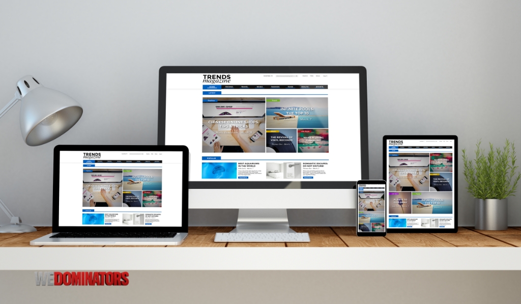
At WeDominators, we understand that your website is more than a digital placeholder—it’s your business’s primary online presence. In today’s mobile-first digital landscape, where users interact across smartphones, tablets, laptops, and large displays, your website must look great and function perfectly everywhere. That’s why our team specializes in responsive website design, crafting experiences that adapt seamlessly across all devices. Whether you’re launching a new brand, reimagining your digital presence, or expanding into ecommerce, our responsive websites are designed to deliver speed, usability, and search visibility—no matter where your customers are browsing.
Why Responsive Website Design Is Essential for Today’s Digital Business
Mobile traffic now dominates the internet. With billions of users relying on smartphones to browse, shop, and engage with content, a desktop-only or fixed-layout site is simply not enough. Add to that Google’s mobile-first indexing and the growing demand for instant, smooth user experiences, and it becomes clear that responsive design is no longer optional. It’s the foundation of a high-performing, modern website.
At WeDominators, we build responsive websites that deliver a consistent experience across all screen sizes, thereby reducing bounce rates and enhancing usability. Visitors expect fast loading, clear content hierarchy, intuitive navigation, and frictionless engagement. Our designs meet those expectations with layouts that fluidly adapt, content that scales, and interactions that work flawlessly on every screen. Search engines favor, more importantly, responsive websites because they eliminate duplicate content, reduce redirect chains, and promote structured markup—making it easier for Google to crawl, index, and rank your pages.
When you work with us, you’re not just getting a mobile-friendly site; you’re getting a fully responsive website design that adjusts intelligently to every device, enhances your local visibility, and supports your conversion goals. From service pages and blog layouts to landing pages and ecommerce stores, we prioritize responsive behavior throughout the entire development cycle.
What Makes a Website Truly Responsive in 2024 and Beyond?
A responsive website isn’t just about shrinking content to fit smaller screens. It involves a thoughtful, technical approach to layout, media, and behavior. At WeDominators, we design using fluid grids, flexible media containers, and dynamic breakpoints that adapt based on viewport width. We rely on HTML5 and CSS3—often paired with JavaScript—to build modular sections that restructure themselves gracefully as screen dimensions change.
We also integrate mobile-specific design patterns, such as touch-friendly buttons, collapsible menus, and swipe gestures, to ensure optimal usability on mobile devices. Our developers optimize for performance using compressed images, lazy loading, minified scripts, and asynchronous loading. By following best practices from Google’s Core Web Vitals, we ensure that the mobile experience is not just functional but fast and enjoyable.
Additionally, we utilize media queries and viewport meta tags to fine-tune behavior across various devices, including tablets, smartphones, desktops, and high-resolution displays. This level of detail allows us to maintain branding consistency, user clarity, and technical accuracy regardless of how your site is accessed. An actual responsive website requires no zooming, no sideways scrolling, and no switching between mobile and desktop URLs—it just works.
How WeDominators Builds Fully Responsive Websites for Maximum Performance
Custom Website Design for Every Screen Size
Our custom web design process begins with your goals. Whether you need a simple brochure website, a robust blog, or an interactive online store, we design each element with responsiveness at its core. We don’t retrofit responsiveness after the fact—we bake it into the architecture from the start. Using platforms like WordPress and visual builders such as Elementor, we create flexible components and page sections that dynamically adjust to screen constraints. For custom-coded projects, we use clean HTML, CSS, and JavaScript frameworks to implement tailored solutions that ensure high performance across all devices.
Our team tests websites across popular device models and screen resolutions to identify any UX inconsistencies and resolve them before launch. Whether a user is viewing your homepage on a 27-inch iMac or a five-inch Android phone, the layout remains visually stunning and functionally reliable.
Template-Based Responsive Solutions
Not every business needs a fully custom build to enjoy the benefits of a responsive design. WeDominators also specializes in customizing premium responsive themes from platforms like Wix, Shopify, and WordPress. These themes serve as a fast and cost-effective foundation for small businesses and startups. We tailor each one to your needs by updating color schemes, typography, content sections, navigation structures, and integrations to align with your brand identity and audience preferences.
While these themes come pre-built with responsive behavior, we ensure that every customization we make continues to meet Google’s mobile usability standards. For those seeking affordable responsive website design with short turnaround times, this option delivers the best of both worlds—form and function without sacrificing time or budget.

Our Website Design Services That Prioritize Responsiveness and Results
UI/UX Design with a Mobile-First Approach
We design with a mobile-first mindset because most of your users will engage with your site on their phones. This approach helps us prioritize essential content, streamline navigation, and simplify calls to action. Our UI/UX designers create prototypes and mockups using tools like Figma and Adobe XD to visualize how users will experience your site on mobile devices before scaling it up to larger screens.
The mobile-first methodology isn’t just about screens—it’s about behavior. Mobile users are often on the go, seeking fast answers, quick directions, or easy transactions. Our designs meet these expectations by ensuring that key features—such as forms, buttons, and service information—are accessible within a few taps. This emphasis on accessibility and clarity increases engagement and supports better conversion rates.
SEO Optimization for Mobile Rankings
Search engines value responsive websites because they make the web more usable. A slow, unresponsive, or fragmented mobile experience can kill your rankings and frustrate potential customers. At WeDominators, our responsive website design services are built around SEO from day one. We implement optimized title tags, clean URLs, well-structured headings, and internal links that enhance your site’s crawlability and indexation.
We also focus on speed, mobile usability scores, and schema markup—essential for enhanced search listings, such as FAQs, reviews, and service details. Every responsive website we build is technically sound, passes Core Web Vitals assessments, and aligns with Google Search Essentials. This combination of design and optimization ensures that your site can rank for competitive keywords, such as ‘mobile-optimized website design company’ or ‘responsive web design agency near me’.
E-commerce Web Design with Mobile Conversions in Mind
If you’re selling products online, your site must be optimized for mobile devices, including smartphones. WeDominators builds responsive ecommerce websites that are visually appealing, fast-loading, and frictionless on mobile. We use Shopify and WooCommerce platforms to create shopping experiences with touch-friendly navigation, collapsible menus, and one-page checkouts designed for thumb usage.
Our mobile shopping interfaces eliminate unnecessary clicks, keep cart experiences smooth, and highlight promotions in mobile banners that don’t overwhelm the layout. We also support payment gateway integrations, shipping modules, inventory syncing, and email marketing automations—all built into responsive frameworks that make mobile sales seamless and secure.
Hosting and Maintenance for Reliable Performance
Great design needs reliable infrastructure. At WeDominators, we offer hosting solutions specifically designed for responsive websites. Our servers are optimized for fast global delivery, featuring an integrated CDN, SSL, and server-side caching. We regularly test page speeds on mobile networks and provide performance audits to improve load time and overall user satisfaction.
We also handle maintenance—including plugin updates, device testing, backups, and mobile rendering checks—so your site continues to function well as devices and browsers evolve. As responsive technology advances, we ensure your website remains modern and competitive long after launch.
Local Recognition and Trust Built on Performance
Trust isn’t just earned through great design—it’s reinforced by visibility and credibility. WeDominators is recognized in trusted service categories such as Website Designer, Marketing Agency, Graphic Designer, and Ecommerce Service across platforms like Google Business Profile. These listings not only increase our local visibility but also give clients confidence that they’re working with a verified provider of responsive web design services.
For our clients, we use the same strategy to help build local trust signals. We ensure that websites include embedded maps, optimized business info, structured data, and verified listings that improve local search presence. If your goal is to appear in “near me” searches or serve users across multiple locations, our responsive design paired with local SEO ensures that your audience finds you—and trusts you—on every device.
FAQs About Responsive Website Design Services
What is a fully responsive website, and how is it different from a mobile-friendly site?
A fully responsive website is designed to automatically adjust its layout, images, content, and navigation based on the screen size and device being used—whether that’s a smartphone, tablet, laptop, or desktop. Unlike a basic mobile-friendly site that may simply shrink content or serve a separate mobile version, a responsive website utilizes fluid grids and flexible media that restructure in real-time. At WeDominators, we build websites that are not only mobile-optimized but genuinely responsive, meaning they deliver a seamless, high-performance experience across every screen and browser without compromising speed, usability, or design consistency.
Will responsive design improve my website’s SEO performance?
Yes, responsive design plays a critical role in SEO. Google prioritizes websites that offer a positive mobile experience, especially since mobile-first indexing has become the standard. A responsive site reduces bounce rates, increases engagement, and helps your content perform better in search results. At WeDominators, we structure responsive websites with optimized heading hierarchies, fast load speeds, alt tags for images, and proper internal linking—all essential components of SEO. We also ensure your site meets Core Web Vitals standards, which further supports search visibility and long-term ranking improvements.
How does WeDominators test websites for responsiveness across devices?
Our process includes multi-device testing at various stages of the design and development cycle. We use emulators, real devices, and browser-based tools to ensure your site functions correctly across different screen resolutions, operating systems, and mobile browsers. Whether it’s an iPhone, Android phone, iPad, Surface tablet, or widescreen monitor, we validate every element for touch-friendliness, readability, and loading behavior. At WeDominators, we treat responsiveness as a performance standard—not an optional feature—so your users receive a seamless experience, regardless of how they access your website.
Can you redesign my existing website to be fully responsive without requiring a complete overhaul?
In many cases, yes. If your existing site has solid content and a usable structure, we can often modernize it with a responsive layout without requiring a complete rebuild. At WeDominators, we begin by auditing your current website to identify what can be reused and what needs to be updated. Then, we rework the layout using mobile-first design principles, rebuild navigation structures if needed, and optimize the site’s performance for mobile devices. Whether you’re on WordPress, Shopify, or another CMS, we can implement responsive functionality that improves user experience and SEO without losing your brand identity.
How much does it cost to get a fully responsive website from WeDominators?
The cost of a fully responsive website depends on the scope, features, and level of customization required. A template-based responsive site is typically more affordable and faster to launch, while a custom-designed responsive website offers greater flexibility and branding precision. At WeDominators, we provide transparent quotes based on your goals and recommend the best solution to match your budget and timeline. Regardless of the path you choose, every website we deliver includes full responsiveness, SEO best practices, and mobile performance optimization to ensure maximum value from your investment.
Let WeDominators Build the Responsive Website Your Business Deserves
Your website should reflect the professionalism, accessibility, and vision of your business—regardless of the device your audience is using. At WeDominators, we don’t just build websites that look great on desktops. We create responsive digital experiences that engage users, perform in search engines, and convert across every screen.
From small business service sites and local landing pages to e-commerce stores and enterprise platforms, we specialize in building fully responsive websites designed with your users and your future in mind. Let us help you create a platform that’s built to adapt, rank, and grow.
If you’re ready to launch a site that performs across devices, meets Google’s standards, and supports your business goals, we invite you to partner with WeDominators. Let’s build something powerful—together.